Color editing + Effect
Desaturate
Hue/Saturation
Invert
Levels
Shift to Color
Temperature/Tint
Color Randomizer Live Effect
Illustrator Location:
Illustrator Main Menu > Window > Astute Graphics > Phantasm > Desaturate
Phantasm Desaturate is a live effect/filter that equalizes color channels. By default, it is the same as using the Hue/Saturation effect with a Saturation value of –100. Note that like Photoshop’s Saturation adjustment, the lightness of the original color is not necessarily preserved. For example, 100% Yellow and 100% Magenta will both be adjusted to a value of 50% Cyan, 50% Magenta, and 50% Yellow.
As a live effect, it is accessible through the main menu, under Effect > Phantasm > Desaturate. It can also be applied directly from the Appearance panel using the “Add New Effect” button at the bottom of the panel, or through the Phantasm panel (see Phantasm: Panel).
After applying the live effect using the menu item (or when clicking on the existing effect in the Appearance panel to edit it), the parameters dialog will appear:
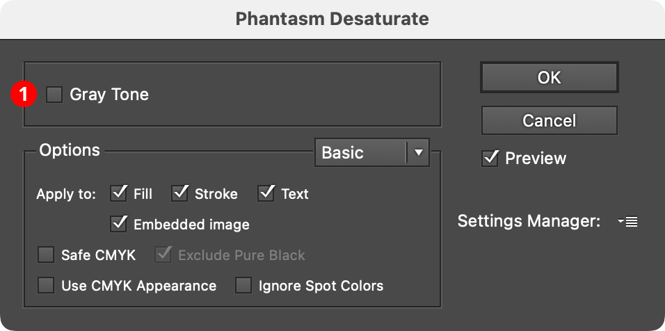
Phantasm Desaturate Dialog
1. Gray Tone
Available only if the document is in CMYK color space. It ensures that the altered color is only composed of Black ink, and it equivalent to using the Hue/Saturation effect in Colorize mode with a Saturation value of 0.
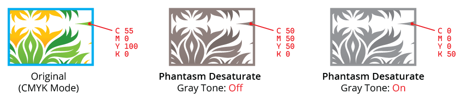
Phantasm Desaturate Example
Illustrator Location:
Illustrator Main Menu > Window > Astute Graphics > Phantasm > Hue/Saturation
Phantasm Hue/Saturation is a live effect/filter that allows hue, saturation, and lightness correction of artwork similar to Photoshop’s. As a live effect, it is accessible through the main menu, under Effect > Phantasm > Hue/Saturation. It can also be applied directly from the Appearance panel using the “Add New Effect” button at the bottom of the panel, or through the Phantasm panel (see Phantasm: Panel).
After applying the live effect using the menu item (or when clicking on the existing effect in the Appearance panel to edit it), the parameters dialog will appear:
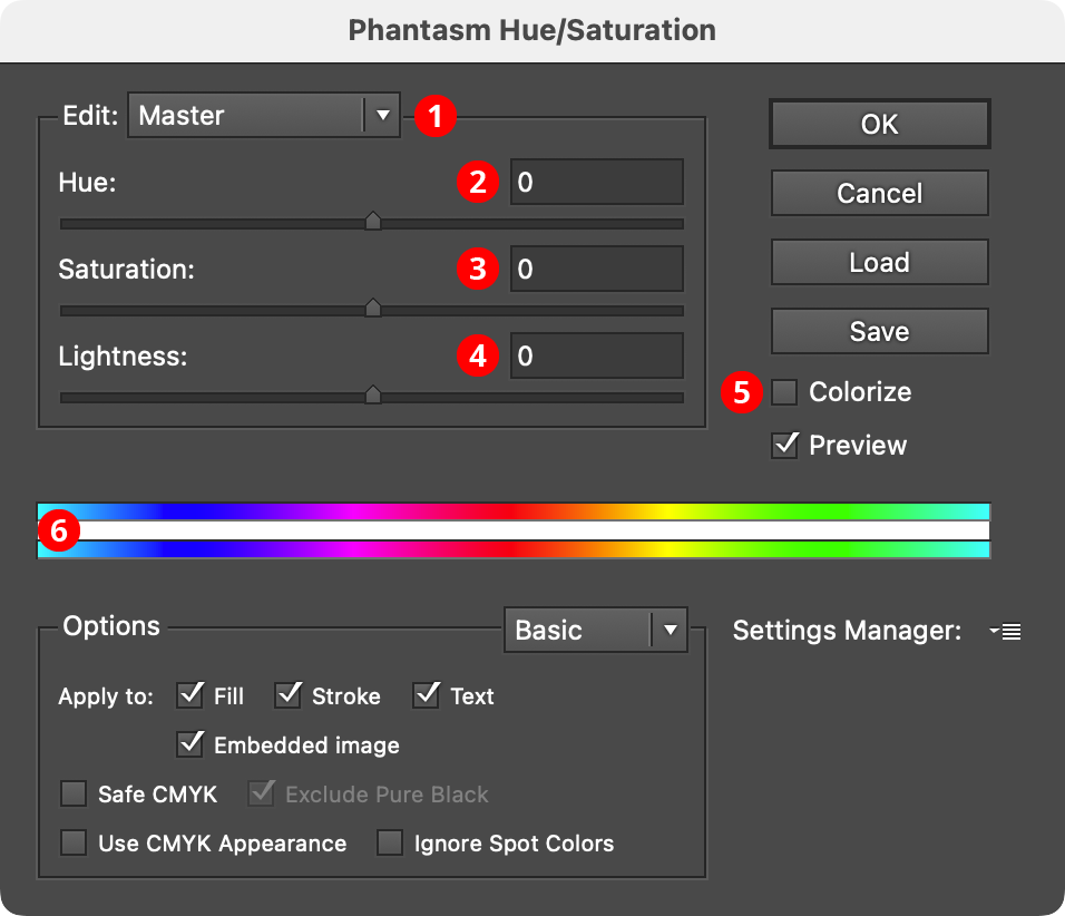
Phantasm Hue/Saturation Dialog
1. Hue Range Pull-down Menu
When set to Master, the adjustments will apply to all colors in the artwork. However, it can also be changed to one of six independent hue ranges. By default, these are: Reds, Yellows, Greens, Cyans, Blues, and Magentas. Each color can have its own adjustment parameters, with variable start, fade-in, end, and fade-out parameters (see item 6 below). These color ranges refer the artwork’s original colors, not the color that results from any Master adjustment. The menu is not available when Colorize is being used.
2. Hue
Adjusts the hue of the art, from –180 to 180. The slider may be dragged, or a numerical value entered directly.
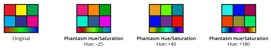
Phantasm Hue Examples
3. Saturation
Adjusts the saturation of the art, from –100 to 100. The slider may be dragged, or a numerical value entered directly.
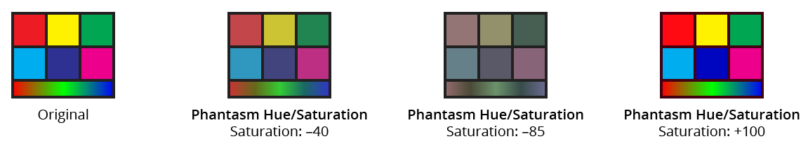
Phantasm Saturation Examples
4. Lightness
Adjusts the lightness of the art, from –100 to 100. The slider may be dragged, or a numerical value entered directly.
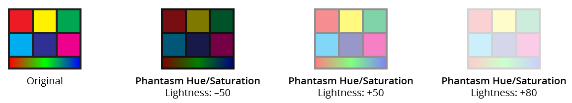
Phantasm Lightness Examples
5. Colorize Checkbox
When enabled, the hue/saturation/lightness functionality is changed; the artwork is changed to a single hue, with adjustable saturation and lightness. In Colorize mode, the Hue parameter changes to a range of 0 to 360, and the Lightness parameter changes to a range of 0 to 100. The Hue Range Pull-down Menu is no longer available.
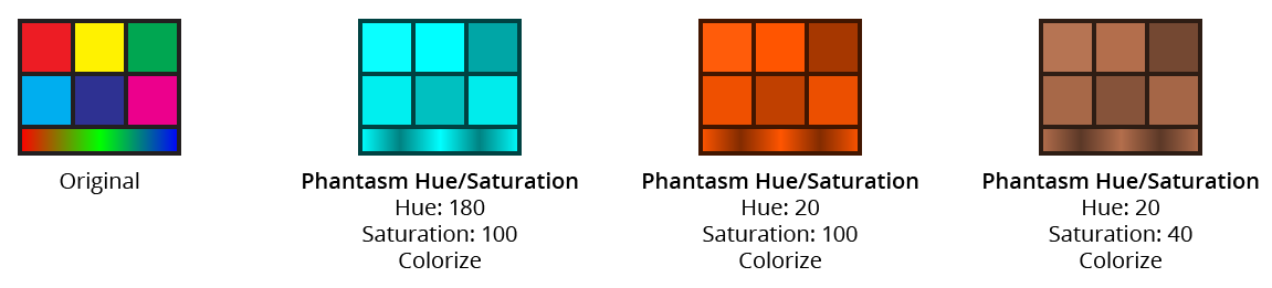
Phantasm HLS with Colorize Examples
6. Color Range Stripes
The top stripe represents the original colors, and the bottom stripe shows the corresponding colors after adjustment. Certain adjustments may not be clearly reflected in the stripes, such as increasing the saturation, as the colors shown are already saturated. When adjusting a hue range other than Master, the stripes will also display controls which offer the ability to adjust the start, fade-in, end, and fade-out parameters for that range:
Phantasm HLS with Colorize Examples
To edit the hue range controls, drag the inner controls (B and D) to specify the range that will be affected 100% and the outer controls (A and E) for the fade-in/fade-out limits. Dragging the area marked C will move all four controls together. It is also possible to drag the regions between controls A and B, and between D and E, to move the pair of controls together (this also makes it possible to put A or E on the opposite end of the stripe from its corresponding inner control). Numeric values are shown for each control’s position above the upper color stripe (a, b, d, and e).
The Hue Range menu color name entries will adjust automatically to best describe the range that is described by the controls. If there are multiple ranges that describe the same basic color, a number will be appended to the color name (for example, there might be Reds and Reds 2).
Illustrator Location:
Illustrator Main Menu > Window > Astute Graphics > Phantasm > Invert
Phantasm Invert is a live effect/filter that simply inverts the levels of all color channels. As a live effect, it is accessible through the main menu, under Effect > Phantasm > Invert. It can also be applied directly from the Appearance panel using the “Add New Effect” button at the bottom of the panel, or through the Phantasm panel (see Phantasm: Panel).
After applying the live effect using the menu item (or when clicking on the existing effect in the Appearance panel to edit it), the parameters dialog will appear:
Phantasm Invert Dialog
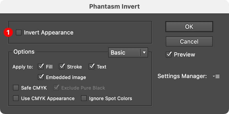
1. Invert Appearance
Available only if the document is in CMYK color space. Most common CMYK colors do not have large amounts of Black in them, so when that channel is inverted, the Black level becomes high and the colors typically get very dark. When Invert Appearance is enabled, artwork is instead inverted in a visually-similar way to how RGB artwork would be inverted, which is generally more useful:
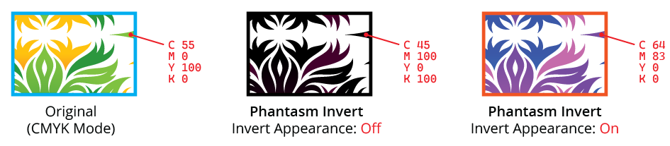
Phantasm Invert Example
Illustrator Location:
Illustrator Main Menu > Window > Astute Graphics > Phantasm > Levels
Phantasm Levels is a live effect/filter that allows adjustment of the black, white, and mid-point gray input levels and output levels of artwork, similar to Photoshop’s Levels dialog. As a live effect, it is accessible through the main menu, under Effect > Phantasm > Levels. It can also be applied directly from the Appearance panel using the “Add New Effect” button at the bottom of the panel, or through the Phantasm panel (see Phantasm: Panel).
After applying the live effect using the menu item (or when clicking on the existing effect in the Appearance panel to edit it), the parameters dialog will appear:
Phantasm Levels Dialog
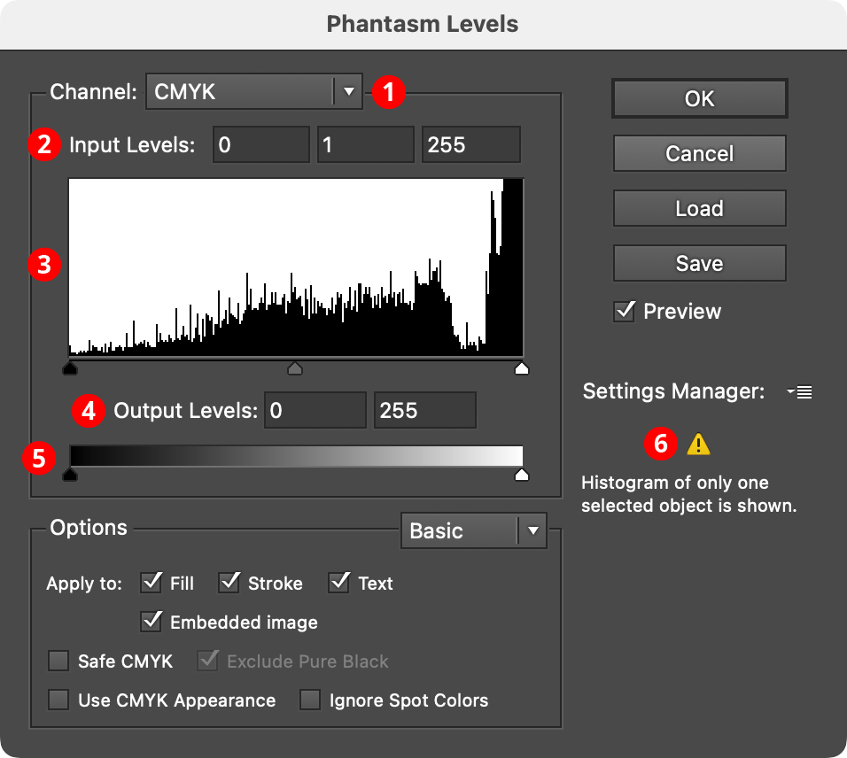
1. Channel Menu
Specifies which channel or channels the current levels settings apply to. For CMYK documents, this includes the composite four process colors (CMYK) as well as each individual color. For RGB documents, this includes the composite three primary colors (RGB) as well as each individual color. In both cases, individual spot colors will also appear in the list, as well as Image Alpha, which affects the alpha channel in images with transparency.
2. Input Levels
Sets the levels for the shadows (0 to 253), midtones (0.1 to 9.99), and highlights (2 to 255). The shadow and highlight levels are absolute values, while the midtone value is always relative to them.
3. Histogram
Shows the levels of the tints of the selected channels within the targeted art as a histogram. Due to plugin limitations, if the Levels live effect is applied to multiple targeted art objects, a histogram of only one of them can be displayed (a warning will be shown). Histograms that cannot be displayed, such as for Image Alpha, will show a “Null” symbol (a circle with a slash through it). The slider thumbs under the histogram reflect the current input levels, and can also be dragged to adjust them.
4. Output Levels
Sets the tonal range that the adjusted art will assume. The shadow level can be brought to the right of the highlight level, in which case the levels will be inverted.
5. Output Level Slider
The slider thumbs reflect the current output levels, and can be dragged to adjust them.
6. Warning Area
Displays warnings, such as when the effect is being applied to multiple targeted art objects, or when a spot color is present in the artwork.
Illustrator Location:
Illustrator Main Menu > Window > Astute Graphics > Phantasm > Shift to Color
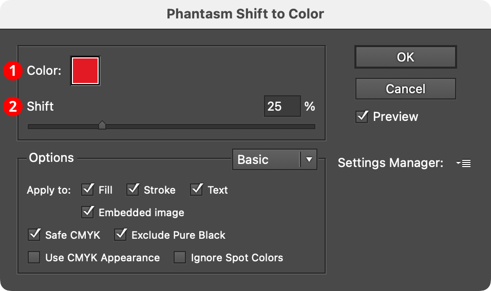
Phantasm Shift to Color is a live effect/filter that allows moving all of an art object’s colors towards a specified color by a variable amount, simulating transparency without actually using it. This may be useful when exporting to basic vector formats or other situations where using actual transparency might require flattening which can cause other issues.
As a live effect, it is accessible through the main menu, under Effect > Phantasm > Shift to Color. It can also be applied directly from the Appearance panel using the “Add New Effect” button at the bottom of the panel, or through the Phantasm panel (see Phantasm: Panel).
After applying the live effect using the menu item (or when clicking on the existing effect in the Appearance panel to edit it), the parameters dialog will appear:
Phantasm Shift to Color Dialog
1. Color
The color that the artwork is shifted towards. Clicking the color chip brings up the native color picker. Although spot colors can be used, the resulting colors will always be process CMYK or RGB (depending on document type).
2. Shift
Specifies the amount of shift, from 0% to 100%.
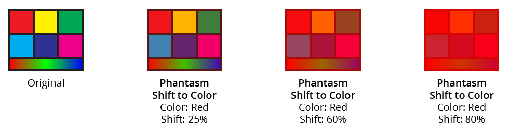
Phantasm Shift to Color Example
Illustrator Location:
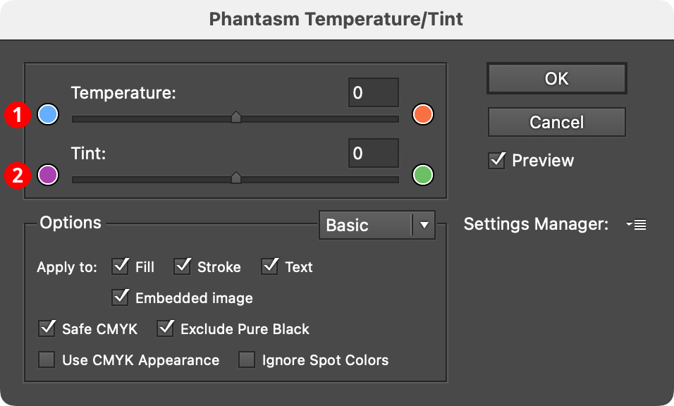
Illustrator Main Menu > Window > Astute Graphics > Phantasm > Temperature/Tint
Phantasm Temperature/Tint is a photography-oriented live effect/filter that allows subtle adjustment of color temperature and tint.
As a live effect, it is accessible through the main menu, under Effect > Phantasm > Temperature/Tint. It can also be applied directly from the Appearance panel using the “Add New Effect” button at the bottom of the panel, or through the Phantasm panel (see Phantasm: Panel).
After applying the live effect using the menu item (or when clicking on the existing effect in the Appearance panel to edit it), the parameters dialog will appear:
Phantasm Temperature/Tint Example
1. Temperature
Changes the “coldness” or “warmth” of artwork by adjusting the orange and blue tones. Ranges between –100 (more blue) and 100 (less blue/more orange).
2. Tint
Adjusts the red and green tones, which can be helpful for compensating for fluorescent lighting or improving natural tone such as skin and greenery. Ranges between –100 (less green) and 100 (more green).
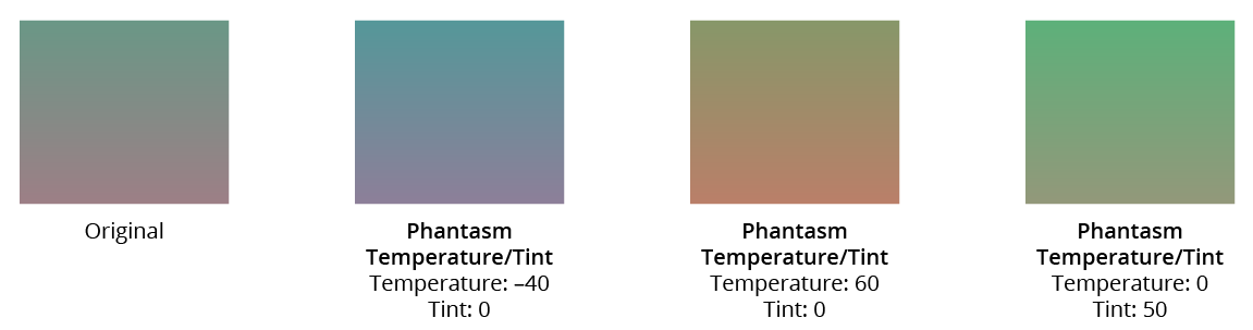
Phantasm Temperature/Tint Example
Illustrator Location:
Illustrator Main Menu > Effect > Randomino > Color Randomizer...
Color Randomizer is an Astute Graphics live effect for randomly and non-destructively varying the hue, saturation, and/or lightness of one or more objects. Both linear and Gaussian random distributions are supported, and the variation amounts can be quantized to a specific number of distinct values. Objects can be “filtered” so only some of them are affected, and, when applying the effect to nested groups, the depth at which it is applied can be specified.
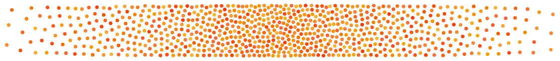
Color Randomizer Example
As with most live effects, Color Randomizer appears in the main menu, under Effect > Randomino. It can also be applied directly from the Appearance panel using the “Add New Effect” button at the bottom of the panel.
Color Randomizer Parameters Dialog
After applying the live effect using the menu item (or when clicking on the existing effect in the Appearance panel to edit it), the parameters dialog will appear:
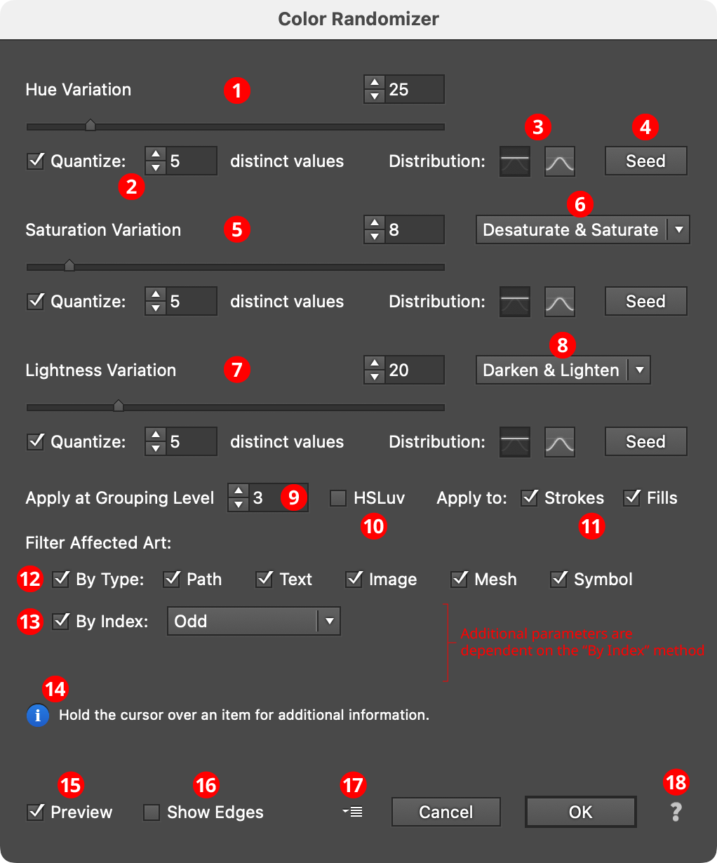
Color Randomizer Parameters Dialog
1. Hue Variation
The amount of variation in hue to apply, ranging from 0 (no variation) to 180 (maximum variation). The value can be changed with the slider or entered numerically in the text box.
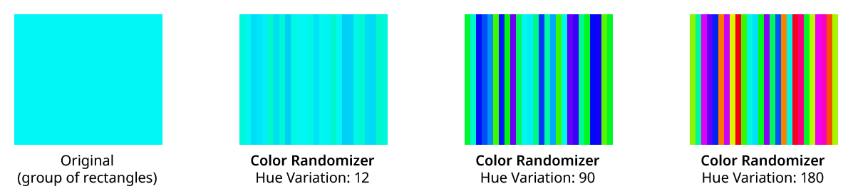
Color Randomizer Hue Variation Examples
Variation values are equivalent to moving in both directions the specified angle away from the original hue around the color wheel. The full wheel is 360°, so a variation of 90 would move 90° or one-quarter of the way, in each direction around the wheel. Any hue between these two end colors may be randomly picked.
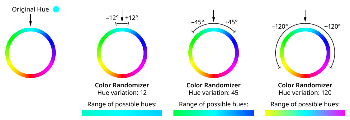
Color Randomizer Hue Variation
2. Quantize
Reduces the range of random variation values so only the specified number of distinct values are produced. For example, a hue variation of 45 would normally produce any value between –45 and 45 — say, 17.63. However, with Quantize turned on and 5 distinct values, the only values that will result are –45, –22.5, 0, 22.5, and 45. Quantized values always include the two end values with some number of evenly-spaced values in between.
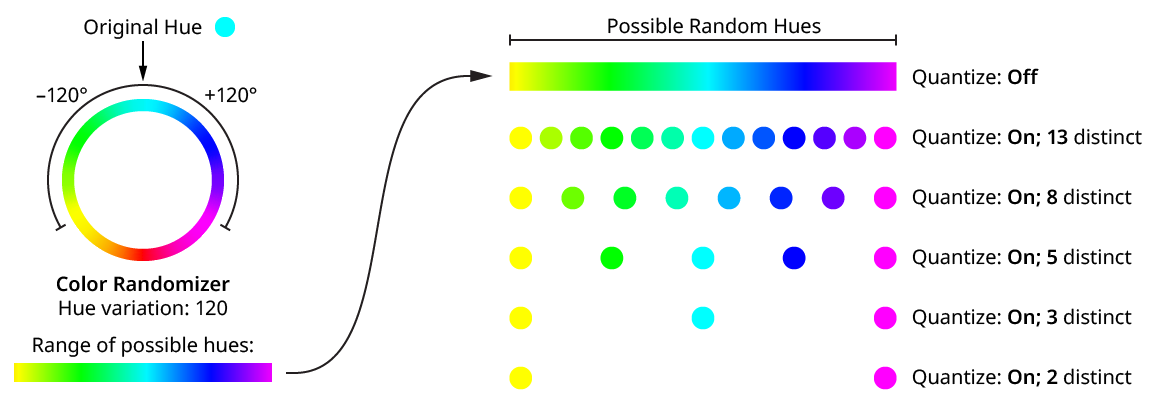
Color Randomizer Hue Variation Quantize
Note that when using a variation of 180 or close to it, the two end values result in the same or roughly the same hue (since they are both halfway around the color wheel, though in opposite directions), so the number of distinct values will appear to be one fewer than specified.
Using the HSLuv color space (see below) changes the way hue and saturation changes are made.
3. Distribution Curves
Specifies either a linear distribution in random values (all values in the range are equally likely to be chosen) or a Gaussian distribution (central values in the range are more likely to be chosen).
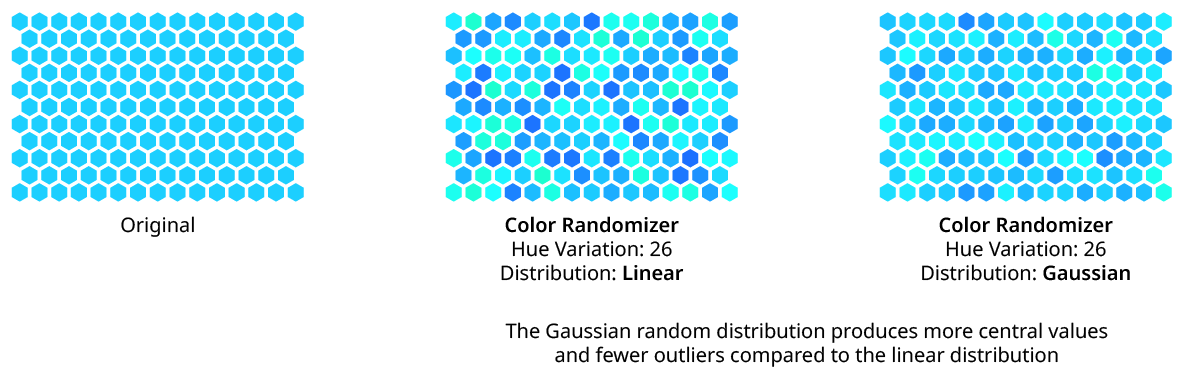
Color Randomizer Distribution
4. Seed
Each random seed number leads to a different sequence of random values. Clicking the button picks a new seed, thereby changing the look of the artwork. To view or specify the seed number directly, Option/Alt-click the button. This lets you recreate a previously-generated look.
5. Saturation Variation
The amount of variation in color saturation to apply, ranging from 0 (no variation) to 100 (maximum variation). Saturation changes are made in the same way that Photoshop and the Phantasm plugin calculates them (unless the HSLuv color space is being used; see below).
6. Saturation Direction
The dropdown menu specifies whether the saturation variation applies in both the negative and positive directions (Desaturate & Saturate), or in just one direction (Desaturate Only or Saturate Only).
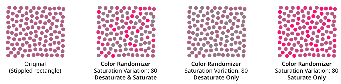
Color Randomizer Saturation Variation Examples
7. Lightness Variation
The amount of variation in lightness to apply, ranging from 0 (no variation) to 100 (maximum variation).
8. Lightness Direction
The dropdown menu specifies whether the lightness variation applies in both the negative and positive directions (Darken & Lighten), or in just one direction (Darken Only or Lighten Only).
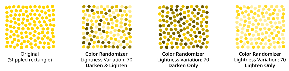
Color Randomizer Lightness Variation Examples
9. Apply at Grouping Level
Unless a live effect is applied above all strokes and fills (a “pre” effect), or inside a stroke or a fill and above other live effects, the art object internally passed to it is always a group. And this group may contain other groups, and so on. The Grouping Level controls the level at which the effect is applied, which affects what elements in the hierarchy get different random opacities. It can range from 0 (representing the top-level art) to 29 (the deepest level of group nesting allowed in Illustrator).
In the simplest case (when the effect is applied to a single stroked-and-filled path), the live effect mechanism separates the stroke from the fill, and passes a stroke-only path and a fill-only path to the live effect in a group. So while a Grouping Level of 0 would apply the same (random) hue change to the stroke and fill (because it is applied at the top grouping level), a Grouping Level of 1 would cause it to choose a different hue change for the fill than that of the stroke:
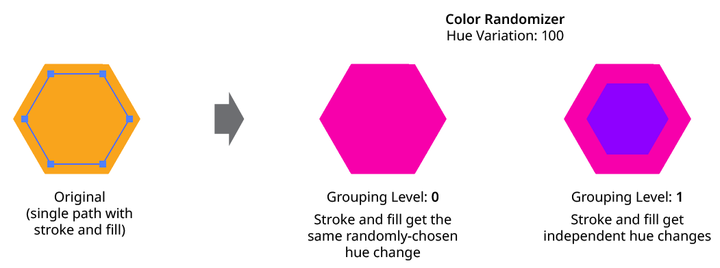
Color Randomizer Grouping Level on Simple Path
Next, consider the case of applying Color Randomizer to a group of stroked and filled paths. This top-level group may or may not have its own stroke and/or fill in its appearance. Here, the group passed to the effect has three groups inside it. One is composed of the paths with group level strokes (if there is no group level stroke, these would have no stroke or fill); another is composed of the paths with group level fills (similarly, if there is no group level fill, these would also have no stroke or fill); and the last is composed of the original paths in the group (and here, strokes and fills are not broken apart).
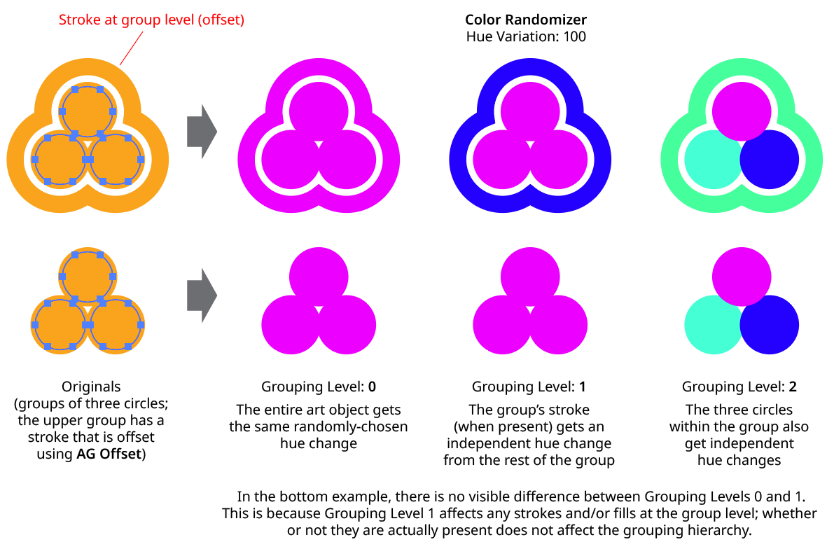
Color Randomizer Grouping Level on Group of Paths
In general, each nested group in the original art requires two Grouping Levels to “dig into,” due to the fact that a group stroke or fill can be present at each level. Because it can be difficult to anticipate what Grouping Level to use because the live effect mechanism can be complicated, it is recommended to simply increase the Grouping Level until the results are what is desired (changing the seed, if necessary, to see what is really changing independently). Setting the Grouping Level above the highest “valid” value will not cause a problem.
10. HSLuv
When enabled, the color changes are made using the HSLuv color space, which reduces perceived brightness changes when the hue and/or saturation is shifted.
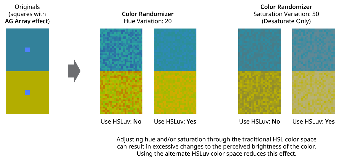
Color Randomizer Use HSLuv
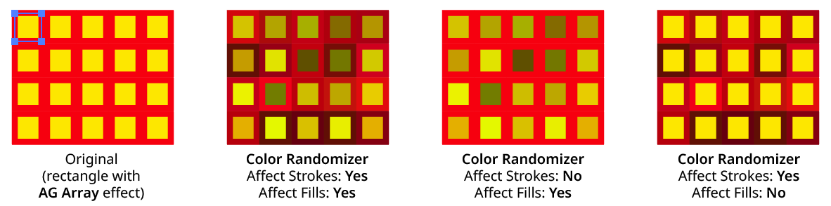
11. Apply To Strokes/Fills
Allows strokes and/or fills to be ignored by the effect. If both options are turned off, the effect would still apply to raster images.
Color Randomizer Apply to Strokes/Fills
12. Filter Affected Art By Type
When enabled, only the art types that have a checkmark next to them will have their colors randomly changed. For example, if many images are each grouped with a text caption, the colors of just the images could be randomized by turning off the “Text” checkbox:

Color Randomizer Filter by Type Example
13. Filter Affected Art By Index
When enabled, each art object’s index is used to determine whether it should have its color randomly changed, using one of seven different methods. The index is simply an integer sequentially assigned to each object at the specified Grouping Level in the order it is encountered, starting with zero for the first object. Generally, the index increases going downwards in the stacking order; however, other live effects present in the appearance stack may change this order, sometimes randomly (such as PathFinder effects). The available By Index methods are as follows:
a. First: Only the first n objects are affected, where n is the specified value.

Color Randomizer by Index First Controls

Color Randomizer Filter by Index - First
b. Last: Only the last n objects are affected, where n is the specified value.

Color Randomizer by Index Last Controls

Color Randomizer Filter by Index - Last
c. First or Last: Only the first and last objects are affected.
d. Odd: Only objects with an odd index (1, 3, 5, 7...) are affected.
e. Even: Only objects with an even index (0, 2, 4, 6...) are affected.

Color Randomizer Filter by Index - Odd & Even
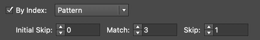
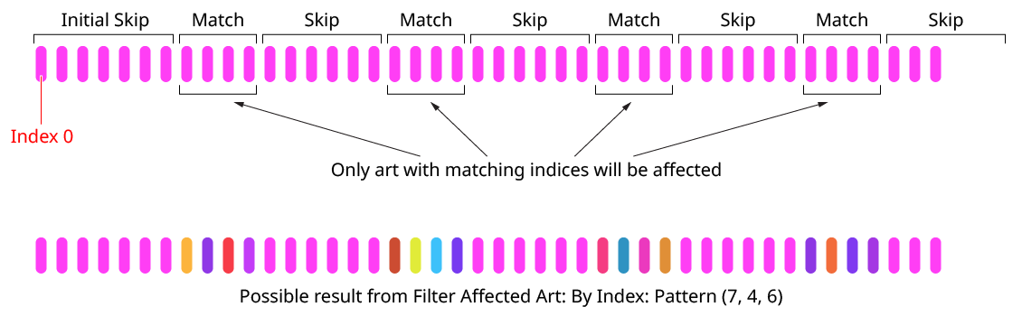
f. Pattern: Creates a repeating pattern of matching indices based on the three pattern parameters.
Color Randomizer by Index Pattern Controls
Initial Skip specifies the number of indices to skip over at the start (art with these indices will not be affected). Then, Match specified the number of indices that will match and therefore be affected. Finally, Skip specifies the number of indices to skip over following the matching indices. When the total of the values in the three parameters is less than the number of eligible art objects, the pattern repeats, using the Match and Skip values in alternation.
Color Randomizer Index by Pattern
g. Randomly: Each art object has the specified random chance (from 0% to 100%) of being affected. The parameter has a seed value that is independent from the hue/saturation/lightness seed values. Just as with those seed values, clicking the button picks a new seed, thereby changing the look of the artwork. To view or specify the seed number directly,
Option/Alt-clickthe button. This lets you recreate a previously-generated look.

Color Randomizer by Index Randomly Controls

14. Informational area
Shows a brief description of each control when the cursor is being hovered over it.
15. Preview
As with all live effects, when enabled, changing a parameter will immediately update the artwork while the dialog is still open.
16. Show Edges
By default, artwork selection edges are automatically hidden when the Color Randomizer parameters dialog is up, to make it easier to see color changes. However, by toggling the checkbox on, they may be shown again.
17. Defaults Popup Menu
Contains several functions concerning the default Color Randomizer settings. Default settings are those that initially appear in the parameters dialog whenever Color Randomizer is applied to art as a new effect (i.e., not when adjusting an existing instance of the effect).
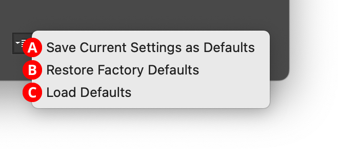
Color Randomizer Defaults Menu
A. Save Current Settings as Defaults: The settings that are currently displayed in the dialog will be saved and used as the defaults in the future.
B. Restore Factory Defaults: The default settings will be restored to those that were in place when the plugin was installed and run for the first time. They will also automatically be loaded into the dialog.
C. Load Defaults: All current settings will be replaced with the default settings (which may have been customized through the first menu item).
18. Help Button
Opens the help documentation in the Astute Manager. If this does not automatically appear, please ensure your Astute Manager is running first.