 Phantasm Controls
Load/Save Buttons
The following effects allow loading and saving of adjustment parameters into a Photoshop-compatible file:
Curves (curve mode): Photoshop curves file (.ACV)
Curves (freehand mode): Photoshop curves map file (.AMP)
Exposure: Photoshop exposure file (.EAP)
Hue/Saturation: Photoshop HSL file (.AHU)
Levels: Photoshop levels file (.ALV)
Duotone: Photoshop duotone file (.ADO)
Clicking on either the Load or Save buttons will open the standard operating system’s file load/save dialog. To maintain Photoshop compatibility, these settings files do not store the parameters in the lower Options section. Instead, these are loaded and saved separately through the Settings Manager menu (see Phantasm: Common Options (Basic)).
Cancel/Reset Button
Holding down the Option/Alt key will temporarily change the Cancel button into a Reset button, which, when clicked, will reset all of the effect’s parameters to their default settings (this does not include the Options, which may be reset to their defaults using the Settings Manager menu).
Preview Checkbox
All Phantasm live effect/filter dialogs feature a Preview button. When enabled, artwork is immediately updated to reflect changes to any effect parameter. As per Adobe’s guidelines for live effects, if Preview is subsequently turned off, no further changes take place to preview the adjustments, but the last previewed state remains visible. The Preview setting is maintained across uses of the effect.
Phantasm Live Effect vs. Filters
All of the live effects in Phantasm can also be applied as filters, through the menu items in the Object > Filters > Phantasm menu. In general, filters can be thought of as live effects which are applied to a base object and then immediately expanded. Thus, a file could be shared with users who do not have Phantasm installed while letting them directly edit an art object on which Phantasm was used (normally, the user would only be able to delete the object or expand it before editing, which is generally undesirable because it might expand things like text into outlines). However, there are several other differences:
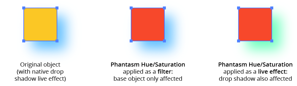
Objects with existing live effects: Filters always operate on the base artwork; they do not “see” the changes made by any live effects applied to that artwork. Thus a Phantasm Hue/Saturation filter applied to an object with a native drop shadow would alter only the base object, with the drop shadow then being re-applied to it, whereas applying the Hue/Saturation as a live effect would change the color of both the base object and the drop shadow (unless the Hue/Saturation were to be dragged above the Drop Shadow in the Appearance panel).
Phantasm Live Effects vs Filters
Symbols and Graphs: These objects can only be affected by live effects, not by filters.
Linked Images: A linked image can be affected by a live effect (if the Auto Rasterize checkbox is enabled), but not by a filter.
Text selections: A portion of text (selected with the Type tool) can be changed using a filter, but not with a live effect.
Envelope Distort Objects: To alter an Envelope Distort object using a filter, you must first choose
Object > Envelope Distort > Edit Contents.Blends: Applying a color adjustment to a blend as a filter alters the start and end object colors; Illustrator then re-blends between them. Applying a color adjustment to a blend as a live effect alters the color of each step in the blend as well.
Actioning: Applying a live effect to artwork cannot be recorded as an action in Illustrator, but applying a filter can be.
Common Options (Basic)
Except for Duotone, Halftone, and Prepress Correct, all of the live effects in Phantasm include a common Options section, which can be in either Basic or Advanced mode. In Basic mode the controls are as follows:
Phantasm Common Options Basic
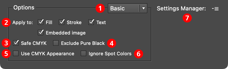
1. Basic/Advanced Menu
Switches the Options section between Basic mode and Advanced mode.
2. Apply To
Allows the effect to be applied to only certain portions of the artwork or to only certain types of artwork. For example, if the Fill checkbox is unchecked, the effect will not change any fills in the artwork. If the Text checkbox is unchecked, text objects will not be changed.
3. Safe CMYK
Available if the document’s color mode is set to CMYK. When enabled, changed colors will have their ink levels adjusted to conform to the color settings in regards to total ink coverage.
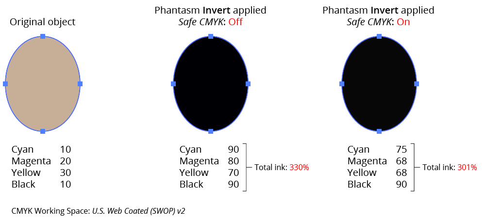
Phantasm Safe CMYK Example
4. Exclude Pure Black
Available if the document’s color mode is set to CMYK and Safe CMYK is enabled. When enabled, and the changed color has only a black component, the Safe CMYK adjustment, which usually has the effect of adding C, M, and Y components, will not be applied to that color.
5. Use CMYK Appearance
Available if the document’s color mode is set to CMYK. When enabled, a color’s grayscale equivalent (which is used when ignoring Rich Black or White in Advanced mode) is derived from its on-screen (RGB) appearance rather than directly from its CMYK value.
6. Ignore Spot Colors
When enabled, spot colors will never be modified by a Phantasm color change, even those that are allowed, such as increasing the brightness.
7. Settings Manager
The popup menu allows a complete set of options (from both the Basic and Advanced sections) to be saved and recalled. Additionally, the default and last used options can be restored.
Common Options (Advanced)
In Advanced mode the following additional options are available:
Phantasm Common Options Advanced
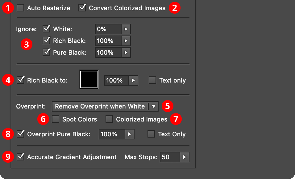
1. Auto Rasterize
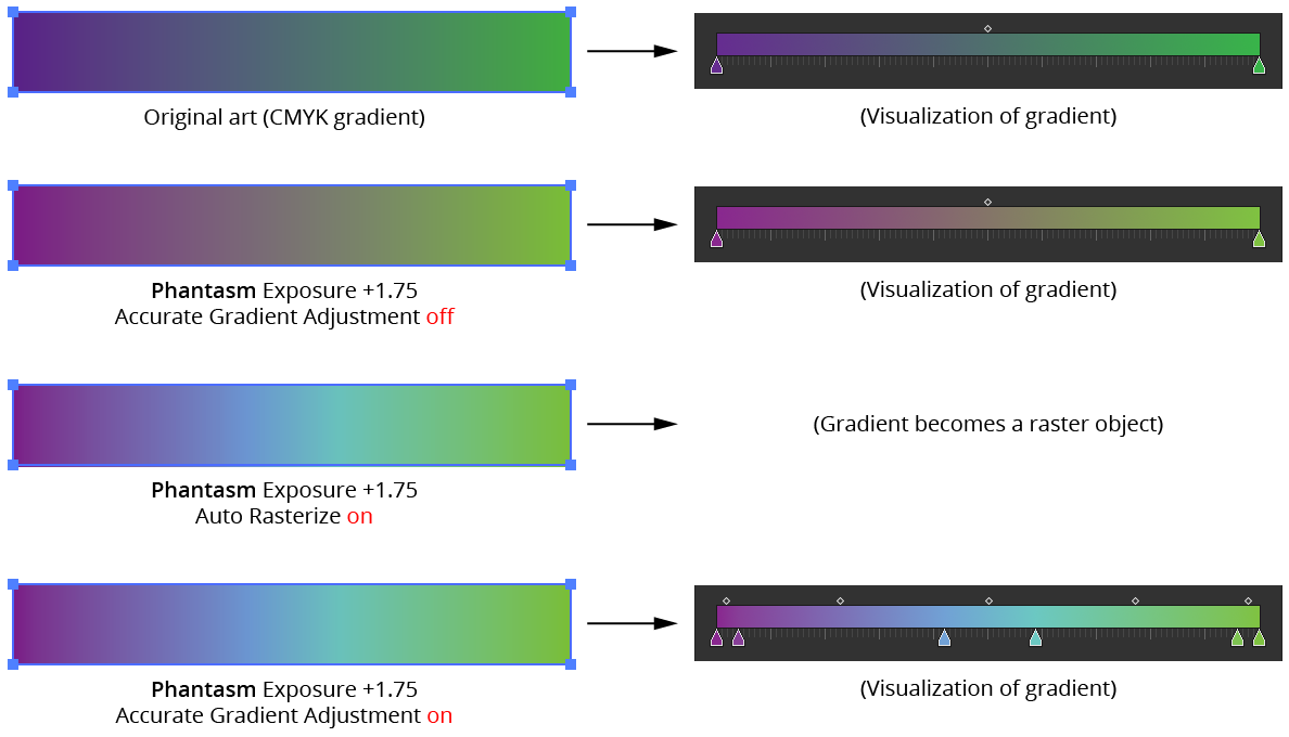
Available only when all four of the checkboxes in the “Apply to:” section are enabled. When Auto Rasterize is enabled, all targeted objects are first rasterized (converted into a raster object) based on the Effect > Document Raster Effect Settings... before color adjustments are applied. This option is necessary to alter the colors in a linked image or in an object with a freeform gradient fill (by default, a message to remind you of this will be displayed when these types of objects have a Phantasm color adjustment effect applied). Auto Rasterize may be useful in other situations, such as adjusting the color of a gradient or gradient mesh, because these objects, as vector, may not adjust identically compared to a rasterized version due to Illustrator’s automatic color tweening between color stops/nodes.
When using this function, individual groups will be rasterized as separate objects. To rasterize as a single bitmap, first group all objects together.
When applying a Desaturate effect in a CMYK document with Gray Tone enabled, the resulting raster object will be grayscale; otherwise it will be generated in the document’s color mode (RGB or CMYK).
When an object that has a spot color is targeted separately or as part of a group, the Ignore Spot Colors option has no effect and the object will always be rasterized. However, when an image colorized with a spot color is targeted separately, the Ignore Spot Colors option has an effect and the object will not be re-rasterized.
When an object that has overprint specified is targeted separately or as part of a group, the Overprint: Ignore option has no effect and the object will always be rasterized. However, when a colorized image that has overprint is targeted separately, the Overprint settings will have an effect and the object may not be re-rasterized.
2. Convert Colorized Images
Normally, bitmap and grayscale images colorized by a non-spot color will be converted to the document’s color model (RGB or CMYK) by the Phantasm effect. But when this option is disabled, a raster image will remain in its original color space; only the color used to colorize the image will be altered.
3. Ignore White/Rich Black/Pure Black
When adjusting colors in artwork, it may be necessary to ensure that white and black colors remain unchanged. For example, black text may need to remain black and not become lighter when the surrounded artwork is adjusted as such. Phantasm offers three options for protecting black and white color ranges (these are applied to vector artwork only, not images).
Ignore White: By enabling the Ignore White checkbox, the range of whites that will be protected from color changes can be set using the percentage slider, ranging from 0% to 10%. A setting of 0% will ensure that only pure white (i.e. no ink level) objects are ignored. Equally, a setting of 5% means that objects ranging from pure white (0%) to 5% grayscale equivalent are ignored. Calculations on the level of white for CMYK, RGB and spot colors are based on the grayscale equivalent of these colors (taking into account the Use CMYK Appearance setting), while grayscale colored objects are analyzed directly.
Ignore Rich Black: By enabling the Ignore Rich Black checkbox, the range of rich blacks (colors with at least one component which isn’t CMYK Black) that will be protected from color changes can be set using the percentage slider, ranging from 90% to 100%. A setting of 100% will ensure that rich blacks which convert to 100% grayscale equivalent are ignored. Equally, a setting of 95% means that rich blacks with grayscale equivalents ranging 95% to 100% are ignored. Grayscale equivalents take into account the Use CMYK Appearance setting.
Ignore Pure Black: By enabling the Ignore Pure Black checkbox, the range of pure blacks (colors where only the Black channel has a value, or the color has been defined as a grayscale) that will be protected from color changes can be set using the percentage slider, ranging from 100% to 1%. This differs from the previous Ignore Rich Black option by not considering composite or spot colors’ level of darkness, and is ideal for maintaining fine black lines, which are normally printed in Black ink only. A setting of 100% will ensure that only objects constructed from 100% Black ink are ignored, where as a setting of 25% means that objects colored in the range of 25% Black to 100% Black are ignored. Normally this option is only relevant to CMYK documents. However, Ignore Pure Black will also control objects defined in grayscale colors when in an RGB document.
These three cut-offs only apply to artwork originally in the defined color ranges and not to artwork adjusted into these ranges. Therefore, for example, text which changes from red to rich black by a color adjustment will not be ignored with any of these options.
All aspects of the objects cut off by these options, including overprint settings, will be ignored.
4. Rich Black to
For reasons of plate alignment in offset printing presses, it can sometimes be desirable to convert rich black (made from more than one CMYK channel) fills and strokes to a single ink such as pure black (100% tint). An example of this is when a thin line is colored with, say, 60% Cyan, 50% Magenta, 40% Yellow and 100% Black resulting in a “rich black”. When printed on an offset press, each ink plate can be slightly misaligned, visually resulting in a series of colored lines grouped together. With this option, this rich black color can automatically be converted to simply 100% Black, which will result in a sharper result.
When enabled, this option will convert rich black colors to the color defined by the color-picker square, which can also be set to a spot ink already present in the Swatches panel. An associated tolerance slider ranging from 100% to 90% determines the level of black eligible for conversion. A setting of 95% would allow objects very nearly rich black to be converted to 100% of the specified ink. The associated option Text Only allows only rich black text objects to be converted. Note this option only applies to editable text, not text converted to outlines or shapes.
The Rich Black to option does not apply to bitmaps, gradients or gradient meshes.
5. Overprint
Overprint control is a critical part of professional design for print. A significant issue that arises from using the color functions available with Phantasm is how they will affect existing overprint settings in the artwork. For example, if your original design contains black text with overprint set and you then Invert the color of the artwork, the resultant text will be white. However, if overprint remains set for the text, it will disappear on the final commercial print. Therefore Phantasm features a number of options to allow you to avoid such conditions.
A further benefit of the overprint options in Phantasm is the ability to use the overprint controls to check all artwork even without invoking any color changes. For example, if you wish to check all artwork for overprint white or simply wish to remove all overprint settings, apply the appropriate options but with zero color change levels.
Due to the complexity and wide-ranging object types and usage scenarios possible in Illustrator, certain conditions and rules have had to be imposed when implementing Phantasm’s overprint options. Due to this and in accordance with best accepted design practices, it is strongly advised that you perform all final checks on your printed artwork via printed proofs. At the very least, it is urged that you set your on-screen view to display overprint preview (View > Overprint Preview) to check for any anomalies.
To highlight the importance of overprint settings, Phantasm color adjustment effect dialogs will produce the warning message “Selection contains objects with overprint” where necessary.
The Overprint pull-down menu contains four entries:
Keep Overprint: Overprint settings for each object will not be changed.
Remove Overprint: All objects will have their Overprint setting set to false.
Remove Overprint when White: Color-adjusted objects which end up as pure white will have their overprint setting set to false.
Ignore Colors with Overprint: Any artwork in the selection with overprint set will be ignored and no color adjustment will take place for these objects.
The Ignore color cut-off options override the overprint controls. For example, if a 100% Black object with overprint set is to be “ignored” by the color cut-off setting, it will maintain its overprint setting regardless of any Overprint options.
Overprint settings are always ignored for mesh, blend, or live paint objects due to Illustrator limitations.
6. Spot Colors
Available when Overprint is set to Remove Overprint or Remove Overprint when White. When enabled, the Overprint setting applies to objects with a spot color too (a spot color is considered “White” if its adjusted tint is 0%). This option independently controls spot color overprints regardless of the state of Ignore Spot Colors.
7. Colorized Images
Available when Overprint is set to Remove Overprint or Remove Overprint when White. When enabled, the Overprint setting applies to bitmap and grayscale images (even if the fill colors is set to Black, they are still considered colorized). For a colorized image to be considered “White,” every pixel in the image must be white.
8. Overprint Pure Black
Available unless the main Overprint setting is Remove Overprint. As well as being able to subtract overprint settings, it is possible to add overprint to pure black (black channel or grayscale only) object fills and strokes. This can often be beneficial to reduce knockout/alignment issues that can occur on an offset press. Enable the Overprint Pure Black checkbox and use the associated slider to determine the percentage Black, and above, that should have the overprint flag added. For example, if the slider is set to 75%, only objects colored with 75% Black (no Cyan, Magenta or Yellow) or 75% grayscale or above would have an overprint setting added (if not already present). The overprint would only apply to the relevant fill or stroke, or both. Enabling the associated Text Only checkbox will determine if only pure black editable text objects are considered to have overprint added. This option is ideal for the majority of designs where it is recommended that 100% Black text is always set to overprint.
Gradient meshes and bitmaps are not affected by Overprint Pure Black.
9. Accurate Gradient Adjustment
Although Phantasm adjusts the colors of all objects faithfully, including the stops of a gradient, when Illustrator re-tweens these new colors, the gradient may not be identical to the same gradient adjusted as a raster using “Auto Rasterize,” especially with more extreme color shifts.
In order to better match vector vs. raster results, vector color gradients can be optimized by enabling the Accurate Gradient Adjustment setting. By automatically adjusting the number and position of color stops in a vector gradient, additional color tweens can be introduced to more closely simulate a pixel-based adjusted gradient. The Max Stops value (between 1 and 100) specifies the maximum number of additional color stops permitted; the greater the number of stops, the more accurate the adjusted gradient will be, at the cost of a more complicated definition.
Phantasm Accurate Gradient Adjustments