 Stylism Tool
Tool Location and Cursor Appearance
The Stylism tool appears in Illustrator’s main toolbar (which must be in Advanced mode: View > Toolbars > Advanced).
Stylism Tool Location
The Stylism tool’s primary cursor is a crosshair. When interacting with the annotated controls, it can assume other forms:
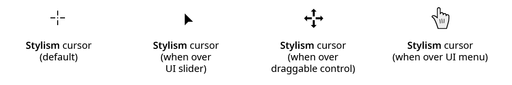
Stylism Tool Cursors
Tool Operation
As the Stylism tool has several keypresses that modify its behavior in different contexts, we suggest installing the free Astute Graphics plugin Astute Buddy, which creates a panel that dynamically updates to inform you of the various keys which can be pressed in the tool’s current context.
The Stylism tool is works in conjunction with the associated Stylism panel, which should be open and accessible. If you are using the free Astute Graphics plugin DirectPrefs, you can have the Stylism panel automatically be shown when the Stylism tool is selected.
To use the Stylism tool, at least one art object must be selected that has in its appearance one of the eight native live effects that Stylism supports (Drop Shadow, Feather, Inner Glow, Outer Glow, Transform, Free Distort, Offset Path, and Gaussian Blur). If this is the case, the art will display (in red, by default) annotated controls (sliders, buttons and dropdown menus) that the tool can interact with to change the effect’s parameters. The controls are always centered over the bounding box of the art object. Common to all effects is a center circle control; the other controls are specific to each live effect.
Common Annotated Controls
The center circle control is displayed by all live effects, and can be used in three ways.
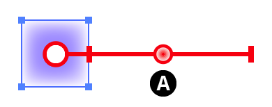
1. If multiple objects with supported live effects are selected, only one can be operated on at a time. This targeted object has its annotated controls drawn in red (by default), while the other objects’ controls are drawn in grey. To target a selected object so its live effect may be edited, click its center circle control:
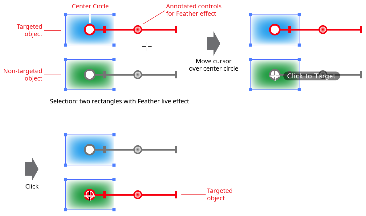
Stylism Click to Target Example
Alternatively, you can simply click or drag the (grey) control of a non-targeted object to target it. However, not all controls may be available for non-targeted objects.
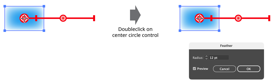
2. Doubleclicking on the center circle control will bring up the live effect’s native parameters dialog for the targeted object, allowing you to edit the live effect in the normal way:
Stylism Opening Native Parameters Dialog
3. When multiple objects with the same live effect are selected, the parameters of some or all of the non-targeted objects may be changed to match those of the targeted object, by syncing them. To do this, drag from the center circle control of the targeted object. A thick, semi-transparent line will follow the cursor. As the cursor is passed over the center circles of the non-targeted objects, the line will remain connecting them, adding them to the sync set and indicating that their live effect parameters will be changed to match the targeted object when the mouse button is released:
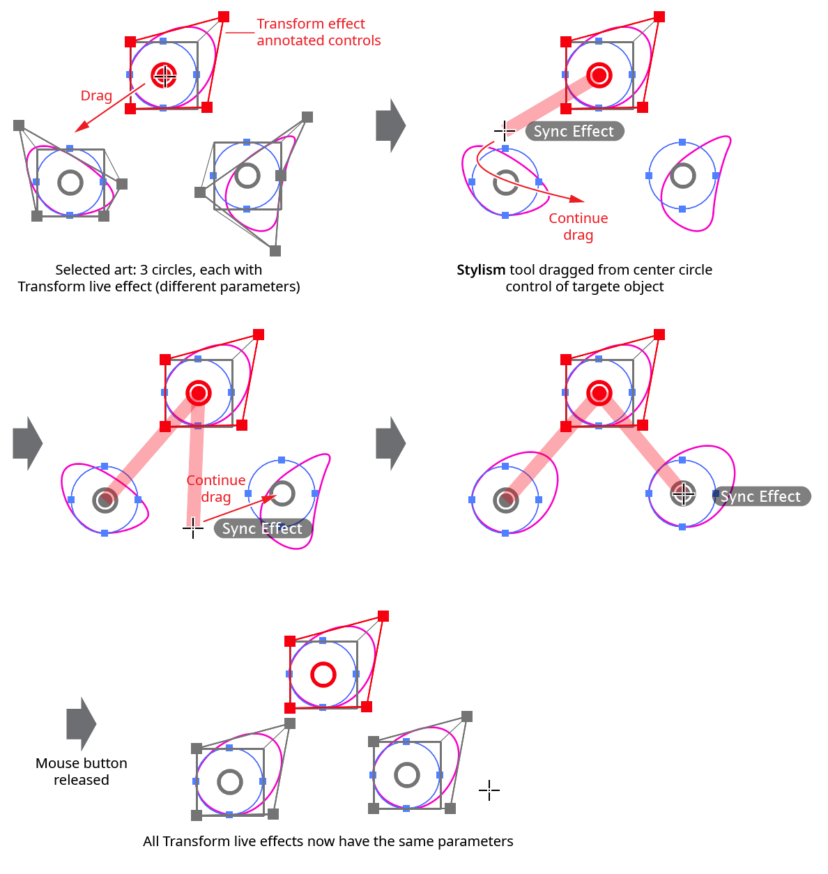
Stylism Syncing Effects
While dragging to sync, there are several keypresses which can be used:
Shift: Instead of adding art to the sync set when the cursor is passed over its center circle, it toggles that state (i.e., if it was set to sync, it will not sync).
Space: Temporarily hides the annotations.
Backspace: Removes the previously-added art (if any) from the sync set.
A: Adds all eligible art to the sync set. If there are many art objects selected, this is much faster than manually dragging the cursor around to add each one individually.
N: Removes all eligible are from the sync set (i.e., clears any sync set selection already made).
Annotated Controls and Common Drag Keypresses
All of the effect’s annotated controls which are dragged, such as slider thumbs, react the same way to several keypresses:
Command/Ctrl: Enables “slow-drag”. When slow-dragging is active, the motion of the cursor is divided by a factor called the slow-drag divider value (specified in the Stylism Preferences dialog), allowing finer control over the movement of the control. For example, if the Slow-Drag Divider is at its default value of 10, and the zoom level is 100%, then moving the cursor by 7 pixels would result in a virtual movement of the control by only 0.7 pixels.
Space: Temporarily hides all of the annotations while the key is held down.
C: Changes the annotation color, cycling through red, blue, magenta, green black, and grey.
Drop Shadow Controls
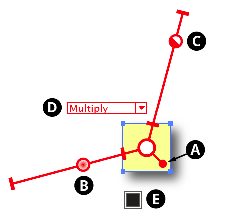
The interactive controls for the native Drop Shadow live effect consist of two sliders and a positioning arm extending from the center circle, along with a dropdown menu and a color chip:
Stylism Drop Shadow Controls
A. Shadow Offset
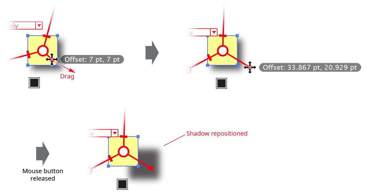
The position of the small “ball” at the end of the shadow position arm in relation to the center circle reflects the offset of the drop shadow. When the cursor is hovering over the control, the current X and Y offsets are displayed. Dragging the control will update the shadow offset after the mouse button is released. The two sliders will rotate with the shadow offset control.
Stylism Drop Shadow Position Control
While dragging the shadow offset control, in addition to the common keypresses (see Stylism Annotated Controls and Common Drag Keypresses), the following keypresses can be used:
Shift: Constrains the angle of the shadow to 45° increments around the general constrain angle.
Option/Alt: Constrains the change in distance to integer values (or less, depending on the zoom level).
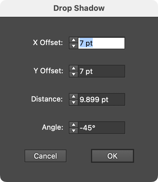
Doubleclicking the control brings up a dialog which allows you to enter the shadow offset numerically, either as the standard X and Y values, or as distance and angle values:
Stylism Drop Shadow Offset Dialog
B. Blur Slider
The blur slider thumb control may be dragged along the blur arm to change the shadow’s blur radius, between 0 and 144 pt. The value increases away from the center circle. When the cursor is hovering over the control or dragging it, the current blur radius is displayed. The blur slider can also be clicked anywhere along its length to move the blur thumb immediately to that position. While dragging the blur slider, in addition to the common keypresses (see Stylism Annotated Controls and Common Drag Keypresses), the following keypresses can be used:
Shift: Constrains the blur radius to integer values.
Doubleclicking the control brings up a dialog which allows you to enter the blur radius numerically.
C. Opacity Slider
The opacity slider thumb control may be dragged along the opacity arm to change the shadow’s opacity, between 0% and 100%. The value increases away from the center circle. When the cursor is hovering over the control or dragging it, the current opacity is displayed. The opacity slider can also be clicked anywhere along its length to move the opacity thumb immediately to that position. While dragging the opacity slider, in addition to the common keypresses (see Stylism Annotated Controls and Common Drag Keypresses), the following keypresses can be used:
Shift: Constrains the opacity to steps of 10%.
Doubleclicking the control brings up a dialog which allows you to enter the opacity numerically.
D. Blending Mode
The annotated blending mode dropdown menu allows you to select the shadow’s blending mode, from among Illustrator’s standard 16 blending modes:
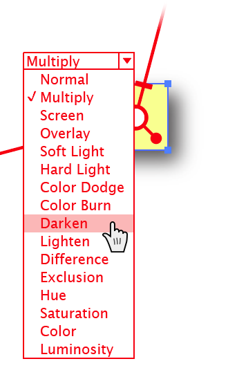
Stylism Drop Shadow Blending Mode Menu
E. Color
The color control shows the color of the shadow. To specify a new color, click the square to bring up the standard color picker. To switch from Color mode to Darkness mode, Option/Alt-click the control. A small “D” symbol is displayed to indicate Darkness mode. To change the darkness value, click the square.
Feather Controls
The interactive controls for the native Feather live effect consist of a single slider:
Stylism Feather Controls
A. Blur Slider
The blur slider thumb control may be dragged along the blur arm to change the feather’s blur radius, between 0.2 and 250 pt. The value increases away from the center circle. When the cursor is hovering over the control or dragging it, the current blur radius is displayed. The blur slider can also be clicked anywhere along its length to move the blur thumb immediately to that position. While dragging the blur slider, in addition to the common keypresses (see Stylism Annotated Controls and Common Drag Keypresses), the following keypresses can be used:
Shift: Constrains the blur radius to integer values.
Doubleclicking the control brings up a dialog which allows you to enter the blur radius numerically.
Inner Glow Controls
The interactive controls for the native Inner Glow live effect consist of two sliders extending from the center circle, along with two dropdown menus and a color chip:
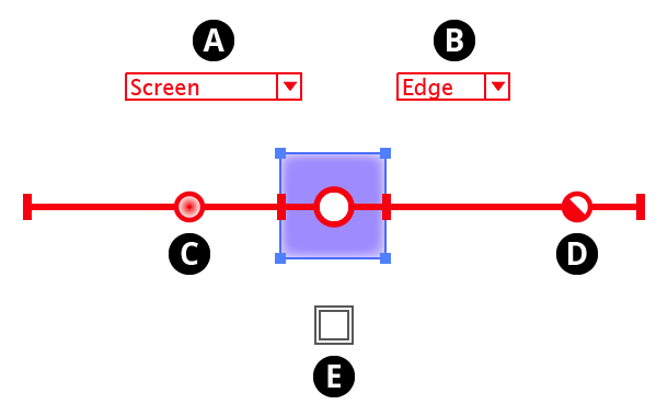
Stylism Inner Glow Controls
A. Blending Mode
The annotated blending mode dropdown menu allows you to select the inner glow blending mode, from among Illustrator’s standard 16 blending modes.
B. Glow Type
The annotated glow type dropdown menu allows you to select the glow type, which can be either Center or Edge.
C. Blur Slider
The blur slider thumb control may be dragged along the blur arm to change the inner glow’s blur radius, between 0 and 144 pt. The value increases away from the center circle. When the cursor is hovering over the control or dragging it, the current blur radius is displayed. The blur slider can also be clicked anywhere along its length to move the blur thumb immediately to that position. While dragging the blur slider, in addition to the common keypresses (see Stylism Annotated Controls and Common Drag Keypresses), the following keypresses can be used:
Shift: Constrains the blur radius to integer values.
Doubleclicking the control brings up a dialog which allows you to enter the blur radius numerically.
D. Opacity Slider
The opacity slider thumb control may be dragged along the opacity arm to change the inner glow’s opacity, between 0% and 100%. The value increases away from the center circle. When the cursor is hovering over the control or dragging it, the current opacity is displayed. The opacity slider can also be clicked anywhere along its length to move the opacity thumb immediately to that position. While dragging the opacity slider, in addition to the common keypresses (see Stylism Annotated Controls and Common Drag Keypresses), the following keypresses can be used:
Shift: Constrains the opacity to steps of 10%.
E. Color
The color control shows the color of the inner glow. To specify a new color, click the square to bring up the standard color picker.
Outer Glow Controls
The interactive controls for the native Outer Glow live effect consist of two arms extending from the center circle, along with one dropdown menu and a color chip:
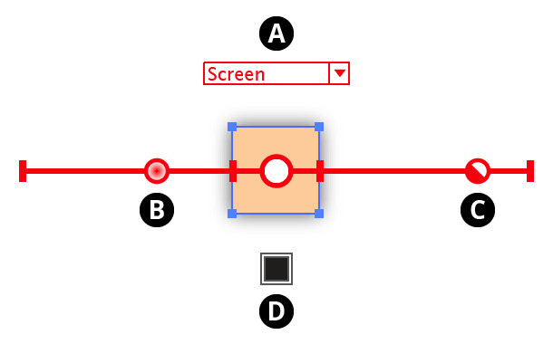
Stylism Outer Glow Controls
A. Blending Mode
The annotated blending mode dropdown menu allows you to select the outer glow blending mode, from among Illustrator’s standard 16 blending modes.
B. Blur Slider
The blur slider thumb control may be dragged along the blur arm to change the outer glow’s blur radius, between 0 and 144 pt. The value increases away from the center circle. When the cursor is hovering over the control or dragging it, the current blur radius is displayed. The blur slider can also be clicked anywhere along its length to move the blur thumb immediately to that position. While dragging the blur slider, in addition to the common keypresses (see Stylism Annotated Controls and Common Drag Keypresses), the following keypresses can be used:
Shift: Constrains the blur radius to integer values.
Doubleclicking the control brings up a dialog which allows you to enter the blur radius numerically.
C. Opacity Slider
The opacity slider thumb control may be dragged along the opacity arm to change the outer glow’s opacity, between 0% and 100%. The value increases away from the center circle. When the cursor is hovering over the control or dragging it, the current opacity is displayed. The opacity slider can also be clicked anywhere along its length to move the opacity thumb immediately to that position. While dragging the opacity slider, in addition to the common keypresses (see Stylism Annotated Controls and Common Drag Keypresses), the following keypresses can be used:
Shift: Constrains the opacity to steps of 10%.
D. Color
The color control shows the color of the outer glow. To specify a new color, click the square to bring up the standard color picker.
Transform Controls
The interactive controls for the native Transform live effect are as follows:
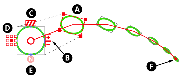
Stylism Transform Controls
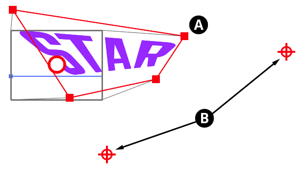
A. Transformed Object Bounds
The bounds of the object after it has been offset, scaled, and rotated are indicated by a red rectangle with nodes at each corner. Dashed grey lines connect the corners of the rectangle with the original object’s bounds, indicated by a rectangle of solid grey lines. Each of the transform parameters may be changed by using the Stylism tool on this rectangle:
Offset: Hovering the cursor over the bounds rectangle (except over an edge or corner) displays the current offset values (
Option/Alt-clickingon the bounds toggles the readout between X/Y mode and distance/angle mode). Dragging the bounds rectangle (except on an edge or corner) changes the offset (holdShiftto constrain the motion to 45° increments around the general constrain angle). The rectangle may also bedoubleclickedto enter the offsets numerically, either as the standard X and Y values, or as distance and angle values:
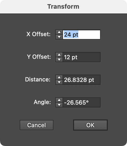
Stylism Transform Offset Dialog
Scale: Dragging one of the corner nodes of the bounds rectangle changes the scaling. Holding
Shiftwhile dragging constrains the aspect ratio. To change only the horizontal scale or only the vertical scale, drag an edge. To specify the scaling numerically,doubleclickone of the edges of corners:
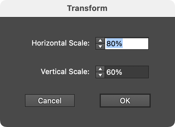
Stylism Transform Scale Dialog
Rotation: When the cursor if hovering outside the rectangle but near one of the corners, the current rotation value will be displayed. Dragging from this location changes the rotation. While dragging, holding
Shiftconstrains the rotation to 45° increments around the general constrain angle.Doubleclickingwhile the current rotation value is being displayed brings up a dialog letting you change the rotation value numerically:
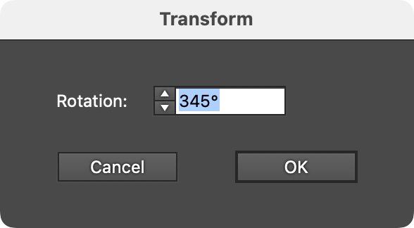
Stylism Transform Rotation Dialog
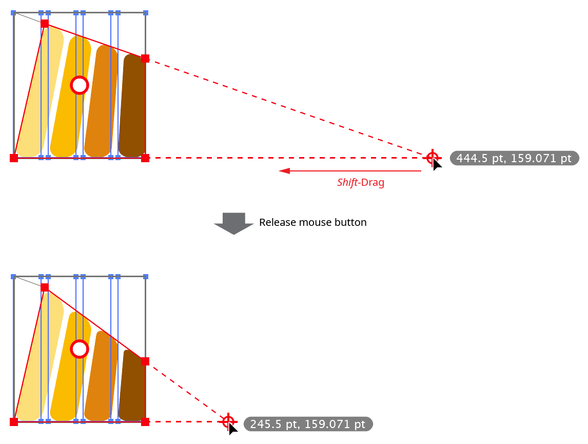
B. Increment/Decrement Copies
The buttons marked with “+” and “–” increment and decrement the number of transformed copies, from 0 to 1000. Pressing Shift while clicking a button will change the value by 10 instead of 1. Pressing Option/Alt while clicking the button will change number of copies while also retaining the position of the last transformed copy:
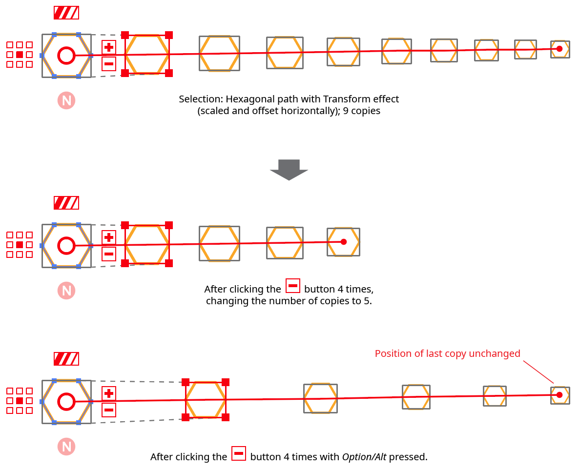
Stylism Transform Copies Button Example
Each copy is joined by a thin red line (the copy chain line), and each copy except the first has its bounding box marked with a rectangle of solid grey lines.
C. Scale Strokes & Effects
Controls the Scale Strokes & Effects setting. When disabled, it shows three stripes of the same width; when enabled, three stripes of varying widths. Clicking the button toggles the setting.
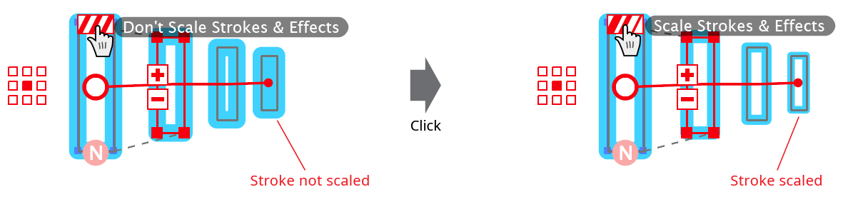
Stylism Transform Scale Strokes Example
D. Reference Point
This nine-block widget is similar to the smaller version in the Transform effect parameters dialog, and specifies the reference point (position of the transformation point relative to the bounds of the original object).
E. Randomize
Toggles the Random parameter of the live effect. When disabled, the button displays “N” (for non-random); when enabled, it displays “R”.
F. Transform Copy Chain Tip
Marks the position of the last copy in the copy chain. When the cursor is hovered over it, a display of the current number of copies will appear. Dragging the control changes the number of copies, extending or shortening the copy chain:
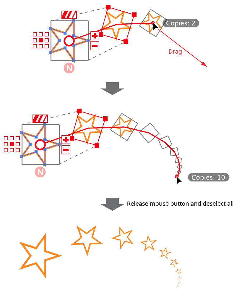
Stylism Transform Copy Chain Drag
Dragging the copy chain tip with Option/Alt held down allows you to move the position of the last copy (and, therefore, all intermediate copies) while retaining the current number of copies. Stylism achieves this by calculating and applying the necessary offset values such that the last copy lands at the given coordinates. The scaling and rotation values are not changed.
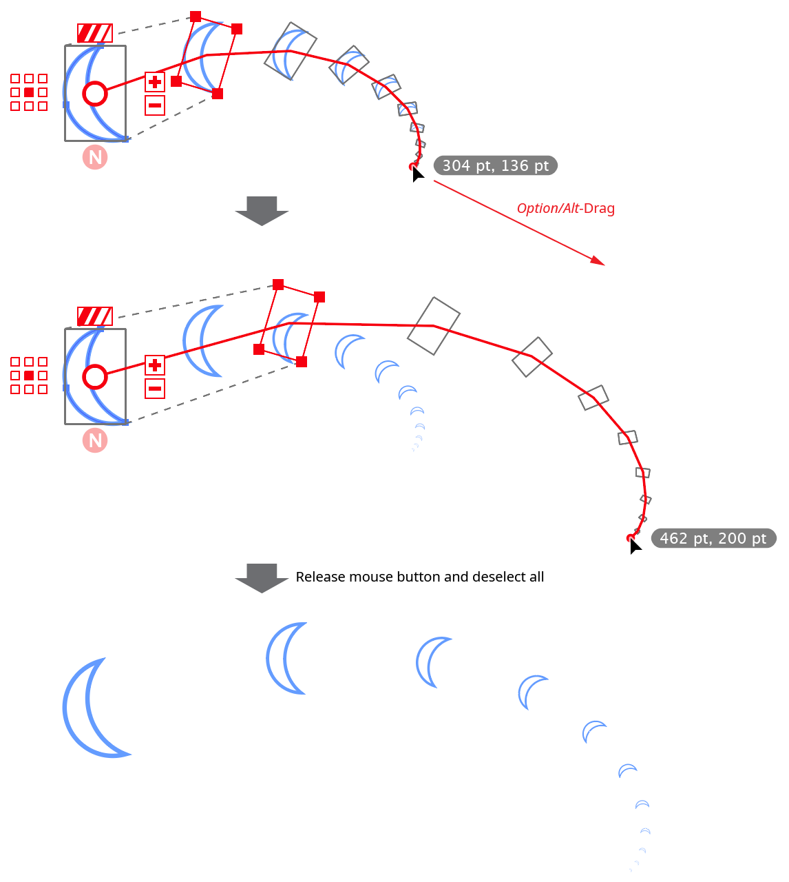
Stylism Transform Copy Chain Drag with Option
Doubleclicking the control brings up a dialog in which the number of copies can be directly entered. If Option/Alt is being held down (so the coordinates of the last copy are displayed), a dialog in which the coordinates can be numerically entered is displayed.
Free Distort Controls
The interactive controls for the native Free Distort live effect consist of a bounding rectangle and two vanishing points:
Stylism Free Distort Controls
A. Distorted Object Bounds
The bounds of the object after it has been free distorted are indicated by a red rectangle with nodes at each corner. When the cursor is hovering over a corner node, the corner’s coordinates are displayed. Thin grey lines connect the corners of the rectangle with the original object’s bounds, indicated by a rectangle of solid grey lines. The corner nodes of the distorted object bounds may be dragged to move them (with Shift to constrain the motion to 45° increments around the general constrain angle). The corners will snap to other objects if Smart Guides are enabled; pressing the U key will temporarily toggle the Smart Guides setting. Each corner may also be doubleclicked to numerically enter its coordinates.
The edges may also be dragged to move them.
B. Vanishing Points
If the distorted bounds are configured such that two of the normally parallel edges are no longer parallel, a vanishing point symbol is annotated at the intersection point of their projections (although this may be off the screen). When the cursor is hovering over a vanishing point, the point’s coordinates are displayed, along with dashed lines connecting it to the corresponding edges. The vanishing point may be dragged to reposition it, with Shift used to constrain its motion along one of the edge projections.
Stylism Free Distort Vanishing Point Drag
Offset Path Controls
The interactive controls for the native Offset Path live effect consist of a relocatable distance widget and a dropdown menu. For many more options when offsetting a path, including proper offsetting of open paths, as well as multiple offsets, we suggest instead using the Astute Graphics’ AG Offset live effect, which has a dedicated tool and panel.
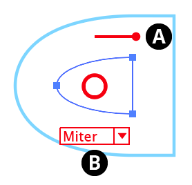
Stylism Offset Path Controls
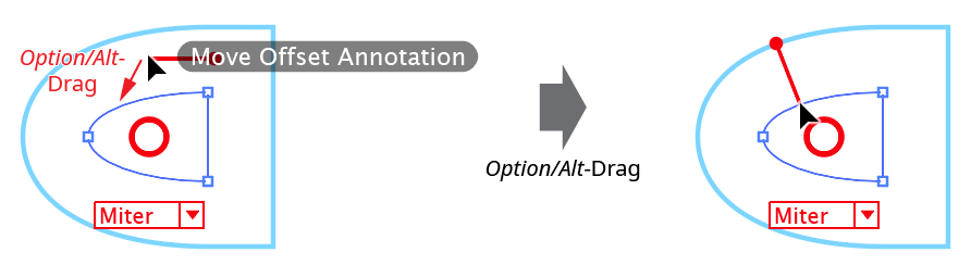
A. Offset Distance
The length of the widget reflects the offset distance. The “ball” end can be dragged to change the offset value (to the right for positive amounts) or doubleclicked to numerically enter the value. By default, the widget is placed above the center circle. However, it can be repositioned by holding down Option/Alt and dragging the end without the ball. It will snap to the path, which can make adjusting the offset value easier because the widget will be rotated perpendicular to the path, with the offset path therefore passing directly through the ball:
Stylism Offset Path Widget Relocate
B. Corner Type
The dropdown menu specifies the types of corners used when offsetting the path, from among Miter, Round, and Bevel. The rarely-used Miter Limit parameter is not adjustable through the annotated UI.
Guassian Blur Controls
The interactive controls for the native Gaussian Blur consist of a single slider.
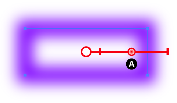
Stylism Gaussian Blur Controls
A. Blur Slider
The blur slider thumb control may be dragged along the blur arm to change the Gaussian blur radius, between 0.1 and 250 pt. The value increases away from the center circle. When the cursor is hovering over the control or dragging it, the current blur radius is displayed. The blur slider can also be clicked anywhere along its length to move the blur thumb immediately to that position. While dragging the blur slider, in addition to the common keypresses (see Stylism Annotated Controls and Common Drag Keypresses), the following keypresses can be used:
Shift: Constrains the blur radius to integer values.
Doubleclicking the control brings up a dialog which allows you to enter the blur radius numerically.
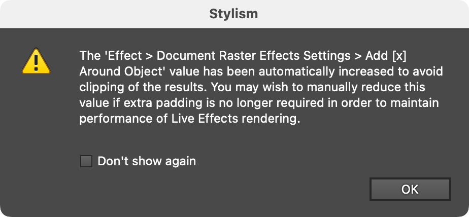
If the blur radius is increased to a value that exceeds the native Document Raster Effects Setting “Add [X] Around Object”, by default this setting will automatically be increased to avoid clipping, and a warning dialog will be shown:
Stylism Raster Effects Around Object Warning